Samoroth
Technically, it's already Friday, but I was travelling home for Christmas today, so I borrowed a little time from tomorrow. Sue me!
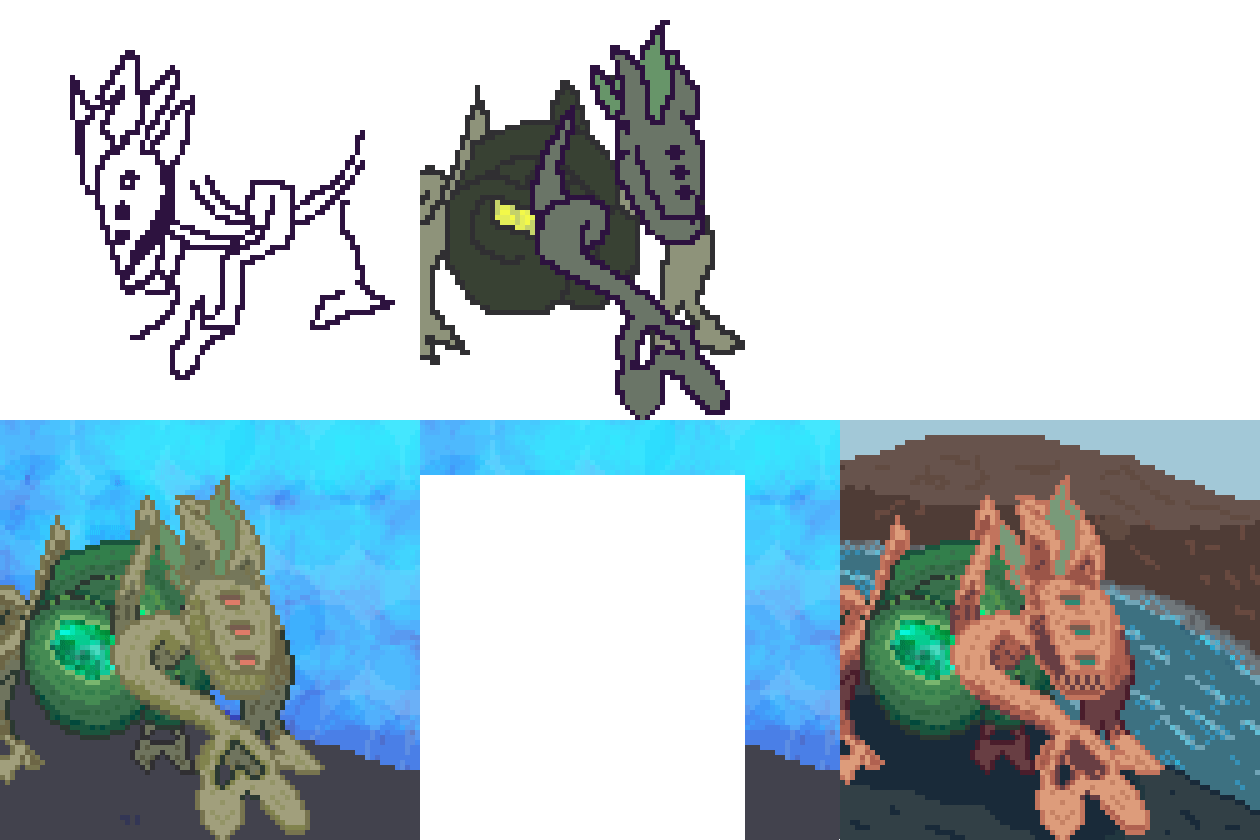
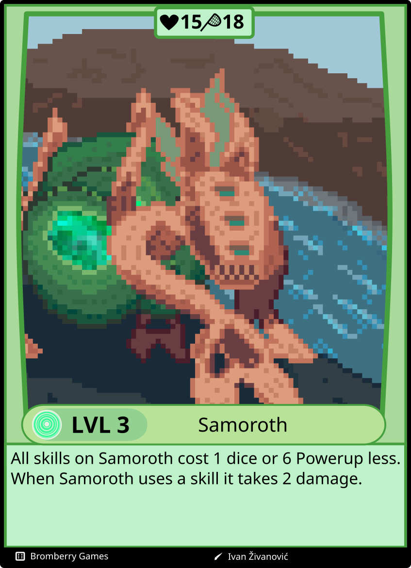
I definitely spent too long on this one, I will say. Certainly, I am happy with it because as you can see in the gif, I did a large change at the end. I am not only talking about the background, but also about the palette for Samoroth. It just didn't look nice. And I could see that immediately, unlike with SO-7 where I only realized once I'd made the gif. This one took me 5 hours.

What, then, did I learn? Good question, but I am not sure. I would say that monochrome designs definitely should be left for little creatures such as Brijrast because it only has a few shapes that need to be distinct. Samoroth, on the other hand is quite complex with its twisting arms and tangle-body. The gray-green on dark-green didn't do it well for me, so I added a harder contrast to it, separating the body and the extremities. To be clear, I am sure one could have made it work with only green or that part of the color wheel, I just wasn't up to the challenge today. Another thing I've sadly noticed is that shading adds so much more it's incredible. I look at some other cards and even though the designs may be alright, if they lack shading they look like special-aid drawings. And even though I am pretty happy with the final result it doesn't communicate anything clearly. Except for maybe that it's something akin to a dog. Perhaps simplicity is just what I should be aiming for with Zvery, but that doesn't really seem right.
Anyway, less talk, more action tomorrow.
Zivan

Zvery
Try and roll the dice
| Status | In development |
| Author | Bromberry |
| Genre | Card Game |
| Tags | Dice, Open Source, physical-games, Pixel Art, Print & Play, Tabletop |
More posts
- ThabumSep 09, 2023
- AmyndoAug 07, 2023
- CosmoonFeb 07, 2023
- From utter trash to fun | Zvery devlog #0.2Feb 07, 2023
- CurloonFeb 06, 2023
- NukerakenFeb 04, 2023
- IonoraJan 21, 2023
- From utter trash to playable | Zvery devlog #0.1Jan 20, 2023
- BubblepuffJan 18, 2023
- RoggipJan 17, 2023

Leave a comment
Log in with itch.io to leave a comment.