Color Palette Process
With every new game comes the challenge of coming up with a color palette. Color me surprised when I found out it wasn’t as simple as the youtube videos explained. I couldn’t simply rely on the mathematical approach that some tutorials offered. That is, one can’t start with one hue then add 180 degrees on the color wheel to get the next color, and go on to create the perfect palette. Or take those and divide the saturation by two and have the next two colors. I have tried, but it always looked kind of… off. As someone who delved into art only recently, it is still very hard to grasp color theory apart from the basic concepts (e.g. complementary and analogous colors). However, it is really a lot of fun to play around with because, as long as it looks good to us, it will probably work.
I will try and describe how I went about creating the color palette for this new game.
The only things I started off with were the concept of the game and a single picture in my mind’s eye. Since the concept is on the goofy-fun side, I wanted many, highly-saturated colors. The picture in my mind was the logo of the game in pink and blue, though it might turn out not to be. This is the first one I came up with:
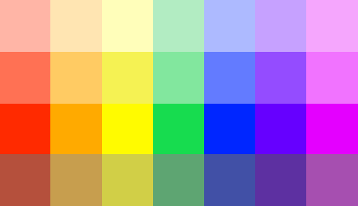
I started with the pink and added the six other colors of the rainbow trying to work around the pink. However, I found the purple too similar to the pink, and after trying a little around, I decided simply to ditch the purple. While fiddling with the colors in general, I stumbled upon another pink that I thought would look better in game. (They look similar, but I promise it is a different one!) So, with the decision of cutting the purple and using another pink, I came to this second palette:
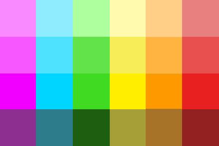
I was already pretty happy with this. It looked like it would give great combinations and a lot of flexibility, but I was having so much fun playing around that I continued. On the first glance, I noticed an imbalance in favor of warmer colors, so I decided to try and cut one of them off. I started completely from scratch, just so I wasn’t anchored in what I had done before. I, again, started with a reddish pink, a blue, and the goal that each color should have two it would look good together with. The result was this:
And this is the current palette we are using. But it isn’t finished! One thing I learned with our previous game, “The Last Axe,” was that the color palette is never finished. I created it after the first prototype (which is already questionable), but then I also didn’t change it any more after that. I designed around the color palette, instead of the color palette around the game. Of course, boundaries need to exist, but it needs to be balanced with flexibility. Especially since the colors in games are affected by various effects, lighting, and other things, one needs to tweak the palette continuously.
If you enjoyed reading this and want to see the color palette in action, or want to offer a great tutorial on how to create a color palette for a game, follow us here on itch or on twitter @BromberryG!
Bromberry Games’
Ivan
Leave a comment
Log in with itch.io to leave a comment.