Designing a Logo
Hey everyone,
today I’ll write a bit about how I approached making the logo for our new prototype Dance Dance Battle Battle-- my logology if you will.
The logo is one of the most powerful marketing tools, I think. You can pop it into the corner of any gif, video, or screenshot and immediately connect each post together. Of course, the game’s art-style itself should make the game recognizable. However, if you post concept art which isn’t in the style of the game, it can be tricky to communicate what game it is. Hence we can use a logo to tie everything that concerns the game together without much effort.
But when do you make the logo? As loose as this guideline is: I think the best thing would be to make it as soon as possible. As indiedevs we need to capitalize on every inch of marketing space we create or seize. I am no authority on this topic of course, but I know that I remember the names of games that show their logo on every post much sooner than those who don’t. So with that in mind, I tried to design a logo.
First, I was unsure how to communicate the dance battle concept in a logo. I think that making some intricate legs or silhouettes would have looked clunky and not just because I can’t draw people yet. With the first, I tried to go in the direction of “hip and cool and young.” Here is how that turned out:
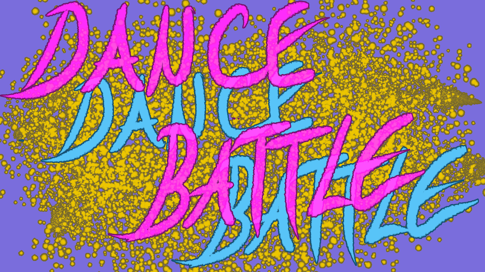
I didn’t even show this to the others. I tried to bring in fancy gold-like glitter as a backdrop for the text. It’s not terrible, but I think that putting this into posts with the opacity and resolution reduced would have made it illegible. Also, the font (my hip handwriting) didn’t feel right and was too cramped.
Then I recalled that, of course, we said this would be like a competition on television. I practically face-palmed upon remembering that. It became much easier to orient myself according to something already existing. I used American Idol’s logo as the main reference, and this was the result:
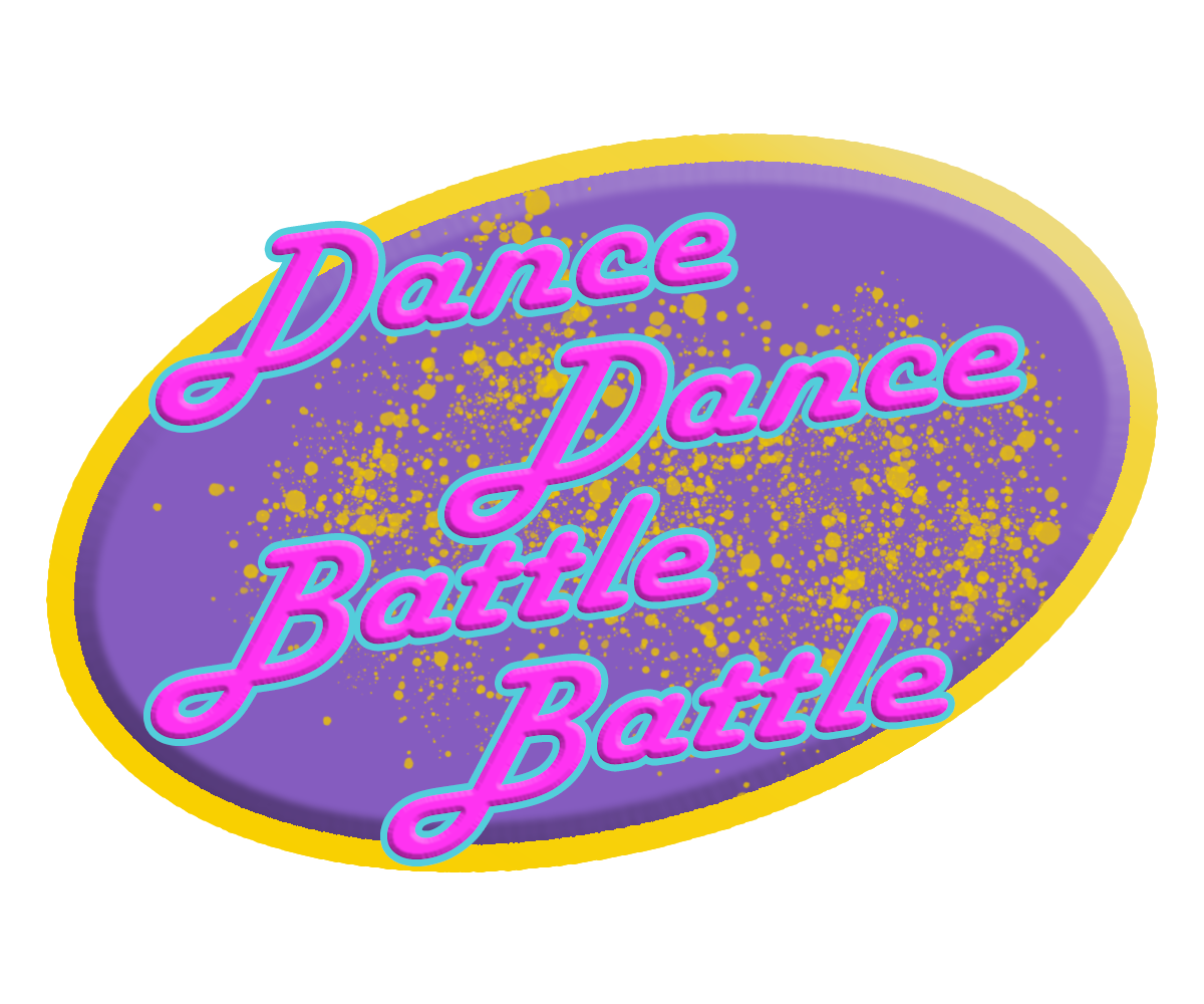
I think this turned out much better. The colors work better together, and it was legible and recognizable even with a small resolution (at least through my eyes). The font seemed also more groovy.
Something still bothered me, though. I couldn’t put my finger on it until I opened it again after a few days; I realized that the shape was simply very forgettable. It seemed obvious that only one shape would have the power to make this logo memorable and in-theme: a star.

This is the most recent iteration. I decreased the groovy and increased the funky by switching the font. And I must say that this looks simply more memorable to me.
. . . However, when can you be sure that you are done? Once you publish it, it is practically final because you can’t go back and switch them out in the previous screenshots, gifs, and videos. But this begs the question: is the logo so important that you should delay using it in the hopes of coming up with a better one?
I feel like this last one, even though it probably isn’t perfect, is good enough because it shows the name of the game and a little personality, which should be enough to serve its purpose of marketing.
Is it important? Yes! Is it the most important thing? No, and any time you worry about it, remember that Avatar simply used papyrus. Sometimes, enough means getting the point across.
If you liked this, follow us here on itch or on twitter @BromberryG. We post a report every two weeks!
Bromberry Games
Ivan :)
Leave a comment
Log in with itch.io to leave a comment.