UI Buttons
One of the reasons I love making games is that I get the opportunity to create many little things in the process of creating a much, much larger thing. One of those mini-creations, I dread and love at the same time: UI buttons.
Though I am not the UI designer--that burden is carried by Simon--I enjoy coming up with the small icons. For this little prototype, I got to make an icon for each of the Ballerina’s four attacks which we currently have. 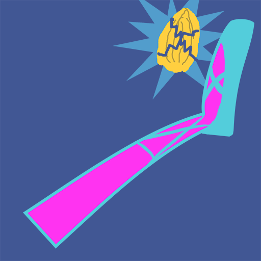

These are the current final versions. From left to right we have: Nutcracker, Swan Lake, Tour de l’Air, and Tchaikovsky Turbo.
Of course, these aren’t set in stone, and these don’t look like their first versions either. I’ll take you through the process of one of them. The icons are based on the particle effects that I made for each attack, so I already knew what it was supposed to represent, I simply had to draw it. “Simply."

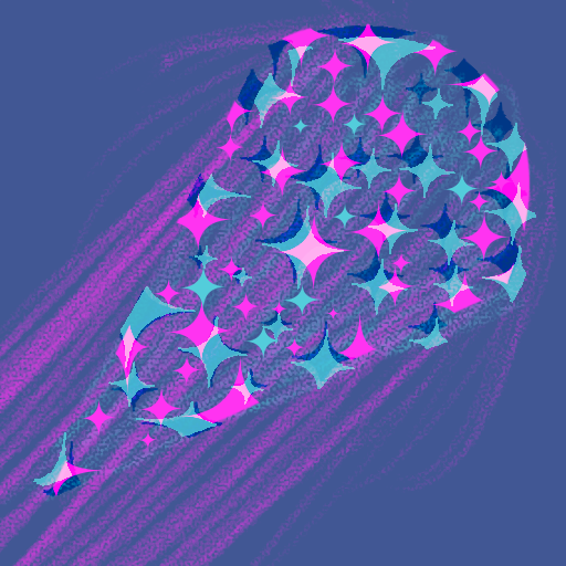
This was the first iteration for Tchaikovsky Turbo, and when I looked for feedback I got asked: “Is that a gramophone?” Then I saw it too! Even though I liked the energy of the picture, it just didn’t make sense. No matter how hard I tried, tornadoes wouldn’t have angled tops, and probably only a few would recognize it as one the first time they saw the icon. Their first thought would be something else.
I mean, why even change it if I liked it? People would see the effect after pressing the button, and then they would get it. But I think that sometimes it’s in the little things.
Imagine unlocking a new attack, you’d be excited by the icon that popped up just before using it. Immediately, your brain would create an expectation based on the picture and go: “That gramophone better blow my mind!” Only to be met by a tornado. It’s a sick tornado, don’t get me wrong, but our brains don’t like to readjust. They like to confirm whatever they already “know.”
The uncomfortable feeling created by such unfulfilled expectations is probably minimal, but it adds up. So I try to avoid it whenever I can.

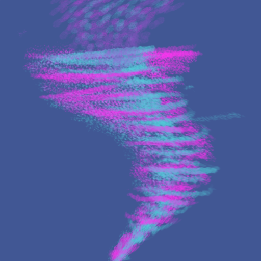
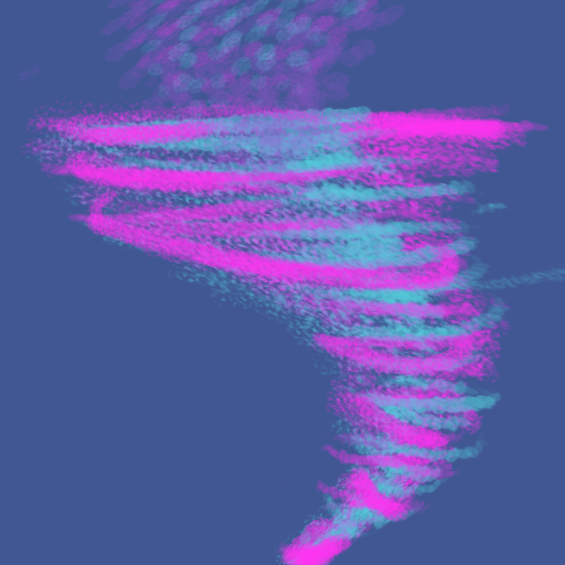
Here are the two next iterations. The first one felt very flat, and definitely needed more movement. The second felt better, but I didn’t like the empty space on the top right, so I made it larger. That’s how I ended up with the current version, but I think I can still add a little to the bottom left to make it even more interesting. However, I’ll leave that for another day.

Follow us on here on itch for more updates regarding Dance Dance Battle Battle.
Follow us on twitter for content that doesn’t get into these progress reports: @BromberryG
Bromberry Games,
Ivan
Leave a comment
Log in with itch.io to leave a comment.